Hi all! We are back from our adventure on the Bourbon Trail in middle Kentucky. Below are a few shots from our visits to Buffalo Trace, Woodford Reserve, Four Roses, and Heaven Hill. We had an amazing time learning and seeing all that was at each place!
Sunday, March 25, 2012
Wednesday, March 21, 2012
On the Road...
Greetings! Sorry no new posts are up this week. I am currently on the road in Kentucky experiencing the beauty that is the Bourbon Trail. Google it. Yum. And absolutely gorge countryside with horse farms as far as the eye can see. Pics will be up when I get home, as well as some new paper items!
Friday, March 16, 2012
Wednesday, March 14, 2012
2 Color Wedding Invitation - Color 2
I promised you photos of the final invitation once I pressed color number 2, which is a medium grey, onto what I showed the other day. When pressing a second color, lining up the 2 designs in the second run is the main challenge. As I mentioned before, when any piece is letterpressed, the printer has to press each color in the final design in separate press runs. The nice thing about this design is that it is primarily a series of type lines, and therefore is much easier to line up. Ta-da!
Monday, March 12, 2012
Black and Cream Wedding
This wedding invitation is very classic and simple in the color choice - black ink on cream paper; however, with the scroll elements on the corners, the design is not overly simple. Having the design area extend to the edges of my press's printable space was not as much of an issue as I initially thought. (Major SIGH of relief!) My challenge for this project was even color saturation. Black ink is as unforgiving as it gets when you look at it, unlike lighter colors where, if the ink coverage is not 100%, even you can't tell. If black ink is at all too thin in coverage, it looks grey. Boxcarpress, my primary resource for both ink and plates, provided a very helpful video tutorial to deal with this very issue, so I lucked out! Final product turned out lovely!
Thursday, March 8, 2012
2 Color Wedding Invitation - Color 1
Letterpressing in multiple colors brings its own challenges in addition to the normal ones. Each piece has to be pressed first with one color and then with the second, third, etc. The difficulty comes in lining the second color to the first while keeping all lines parallel and maintaining an even press. You also have to clean off ink colors between runs and prep your press each time separately. I had my first experience with this on a Christmas card about 3 months ago. It was a challenge that I, being self-taught, had to try and re-try numerous different times before I felt confident enough to do the full run. The images below show the first color (purple) on what will be 2-color wedding invitation. I will post the final product once it is finished!
Monday, March 5, 2012
Spring is in the Clover
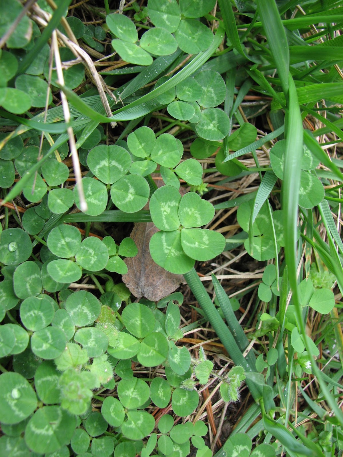
Some of you may not know, but I have 1 very specific talent that is, according to my husband, very bizarre. I have an uncanny ability to find 4+ leaf clover... see?
close up:
and one more:
So! in light of the clovers in bloom, specifically the 4 leaf variety, consider some bright green and happy stationery!!
close up:
and one more:
So! in light of the clovers in bloom, specifically the 4 leaf variety, consider some bright green and happy stationery!!
Monday, February 27, 2012
Navy or Dusty Blue?
This is a recent stationery project I completed with a whole lot of color woe. The client requested the ink color navy, which at the start, I was like, "oh, navy, super easy, simple, no problem." Then I started mixing the color. I literally came up with over 20 shades of navy, dark blue, dusty blue, midnight blue, dark bright blue, true blue, and a very sad blue-grey color. Sooooo, lesson? Yes. I learned that what I should have already known - people have different opinions on what colors are and getting a solid printed example of the color is the safest and most painless way to get the perfect color. I did eventually find the perfect navy, but geesh it took some time to get there. Above is not a picture of the final, but one of the navies and a dusty blue.
Thursday, February 23, 2012
Welcome Baby Girl!
This project was and remains very dear to me because of the client. They are long time friends who asked me to design and press a baby announcement for their first born baby girl (who is so beautiful!!!). The most fun part of the design process was that they are calling their sweet baby by her middle name, so I felt that needed to be subtly conveyed through the design without being too bold or distracting to the overall card. They chose soft teal for the color which I LOVE since it is not the typical light pink. They were also integral in the font selection process, which made it much easier to capture the vibe they wanted.
Monday, February 20, 2012
So much for winter...
Hi all! Sorry for the brief absence... I've been busy with a number of projects, not all of them letterpress related. I do want to share with you my first start to finish design project that I pressed. Yes, I realize it is 1.5 months late in being posted, but I am still loving it. Yep, that's right, my holiday card. I drew the letters in Adobe Illustrator and added just a bit of type for our names and date at the bottom. I chose to do a small card (3.5 x 5 inches) because of postage and perceived real estate on our friends' and families' refrigerators. We did the photo ourselves by just setting the timer on the camera, which, in and of itself was a mild train wreck because of the dogs, but we like the final. I chose the color gold for the ink because 1. it's super "in" with regards to the fashion world 2. I have it in stock 3. I felt it made the crossover from Christmas to New Years. We did the black and white photo with rounded corners to add that vintage vibe that was not too serious.
Thursday, January 19, 2012
Teal is the new Black...
Ready for Spring yet? Not that Nashville has had a crazy winter or anything, but the winter palette is the main thing getting to me. Bring on the bright colors!! Consider teal, pink, yellow, green as great options for very professional yet very upbeat stationery:
Tuesday, January 10, 2012
Wednesday, January 4, 2012
Happy New Year!
2012...wow. Seems so future, so flying car... so space travel. One thing I love, actually, is that exact juxtaposition between technology and antiquity. Mixing of old and new. Love it! Letterpress is one of those things for sure. And, if you are moving into a new year and want to update something in your life, consider your stationery. What better way to say, ''I appreciate you" than to write a note and mail it to someone special?
Friday, December 2, 2011
Thanks!!
Thank you to everyone who placed orders for personal letterpressed stationery! Pictures from new jobs coming soon!
Thursday, December 1, 2011
Last Day of Letterpressed Stationery Sale!
Order by end of day today to receive 10% off your personal stationery order! Price starts at $45 for 25 cards and envelopes with discount!! Email me if you have any questions!
Subscribe to:
Posts (Atom)