Both of these orders called for a medium-dark grey ink with the edges painted by hand in a light grey ink. They were printed on a very heavy pearl white paper and turned out amazing!
Hi all! We are back from our adventure on the Bourbon Trail in middle Kentucky. Below are a few shots from our visits to Buffalo Trace, Woodford Reserve, Four Roses, and Heaven Hill. We had an amazing time learning and seeing all that was at each place!
Greetings! Sorry no new posts are up this week. I am currently on the road in Kentucky experiencing the beauty that is the Bourbon Trail. Google it. Yum. And absolutely gorge countryside with horse farms as far as the eye can see. Pics will be up when I get home, as well as some new paper items!
I promised you photos of the final invitation once I pressed color number 2, which is a medium grey, onto what I showed the other day. When pressing a second color, lining up the 2 designs in the second run is the main challenge. As I mentioned before, when any piece is letterpressed, the printer has to press each color in the final design in separate press runs. The nice thing about this design is that it is primarily a series of type lines, and therefore is much easier to line up. Ta-da!
This wedding invitation is very classic and simple in the color choice - black ink on cream paper; however, with the scroll elements on the corners, the design is not overly simple. Having the design area extend to the edges of my press's printable space was not as much of an issue as I initially thought. (Major SIGH of relief!) My challenge for this project was even color saturation. Black ink is as unforgiving as it gets when you look at it, unlike lighter colors where, if the ink coverage is not 100%, even you can't tell. If black ink is at all too thin in coverage, it looks grey. Boxcarpress, my primary resource for both ink and plates, provided a very helpful video tutorial to deal with this very issue, so I lucked out! Final product turned out lovely!
Letterpressing in multiple colors brings its own challenges in addition to the normal ones. Each piece has to be pressed first with one color and then with the second, third, etc. The difficulty comes in lining the second color to the first while keeping all lines parallel and maintaining an even press. You also have to clean off ink colors between runs and prep your press each time separately. I had my first experience with this on a Christmas card about 3 months ago. It was a challenge that I, being self-taught, had to try and re-try numerous different times before I felt confident enough to do the full run. The images below show the first color (purple) on what will be 2-color wedding invitation. I will post the final product once it is finished!
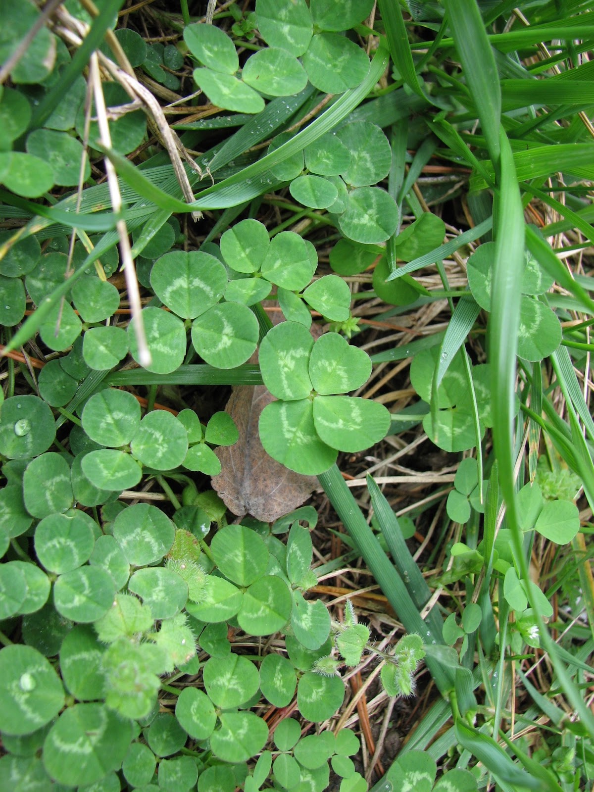
Some of you may not know, but I have 1 very specific talent that is, according to my husband, very bizarre. I have an uncanny ability to find 4+ leaf clover... see?
close up:
and one more:
So! in light of the clovers in bloom, specifically the 4 leaf variety, consider some bright green and happy stationery!!


.JPG)
.JPG)


.JPG)